Skip to Content
AnalyticsCreatives

Creative analytics

Creative analytics answers the question every marketer actually cares about: which content makes money. Not which ad got clicks — which hook, which angle, which pairing of the two put revenue in the bank.

Because every creative you make in Omnymous is built from known parts — a hook, an angle, a customer avatar, an offer — the platform can take performance apart by any of those parts on its own. You never touch a UTM or invent a naming convention; the lineage travels with the creative from the Library all the way to the order it drove.

Open Creatives under ANALYTICS. The switcher at the top right has four views: Overview, Combinations, Pages and Insights. The date range and attribution model pickers above them apply to everything.

Overview

The Overview is your creative command center: what you produced, how the portfolio is performing, and who’s actually winning.

The Creatives Overview: the Creative Output band with the production pipeline, hit-rate dial and winning creatives, above the portfolio charts

Creative Output

The band at the top reads in two halves, on purpose:

  • Produced this period — how many items you Generated and how many creatives Launched (entered the market for the first time), with the launch rate between them. Below sit your AI cost (period), Cost / launched and the Generated mix, plus the Production cadence chart — generated and launched, day by day.
  • In market this period — every creative With Spend (whenever it launched), how many are Winners, and the hit rate between them.

The dial on the right shows your hit rate against the 5–10% industry expectation band — if you’re inside it, you’re producing at a healthy standard. Next to it, Winning creatives lines up the winners themselves, each with its return and spend.

Decide what “winning” means

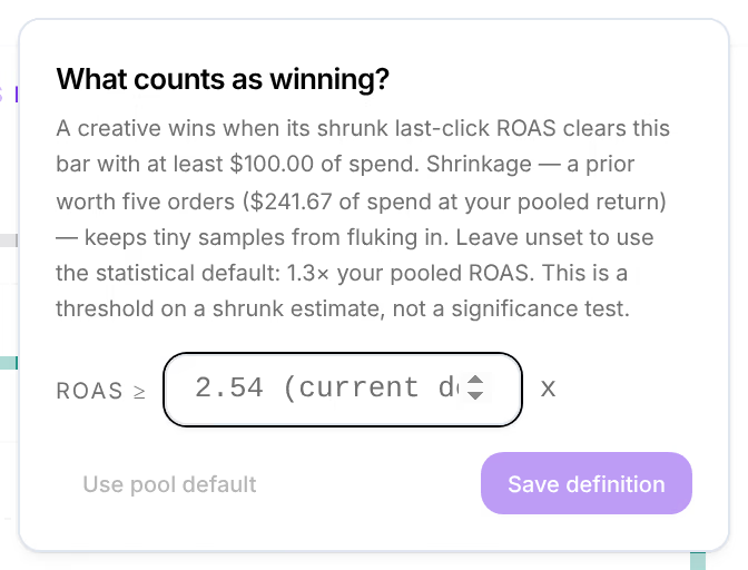
The Winner ≥ … control in the band’s corner is yours to set. Click it and define your own bar — for example ROAS ≥ 2.0x — and every winner count, the hit rate, the dial and the leaderboard marks recalculate to your definition. Insights use the same bar, so a Creative Winner finding means winning by your rules.

The winner definition popover: "What counts as winning?" with a ROAS threshold field, Save definition and Use pool default

Leave it unset and Omnymous uses a statistical default: 1.3× your portfolio’s pooled ROAS. Either way the bar is judged on a shrunk ROAS — small samples get pulled toward your average, so a creative can’t fluke its way to winner on a lucky $100.

The portfolio charts

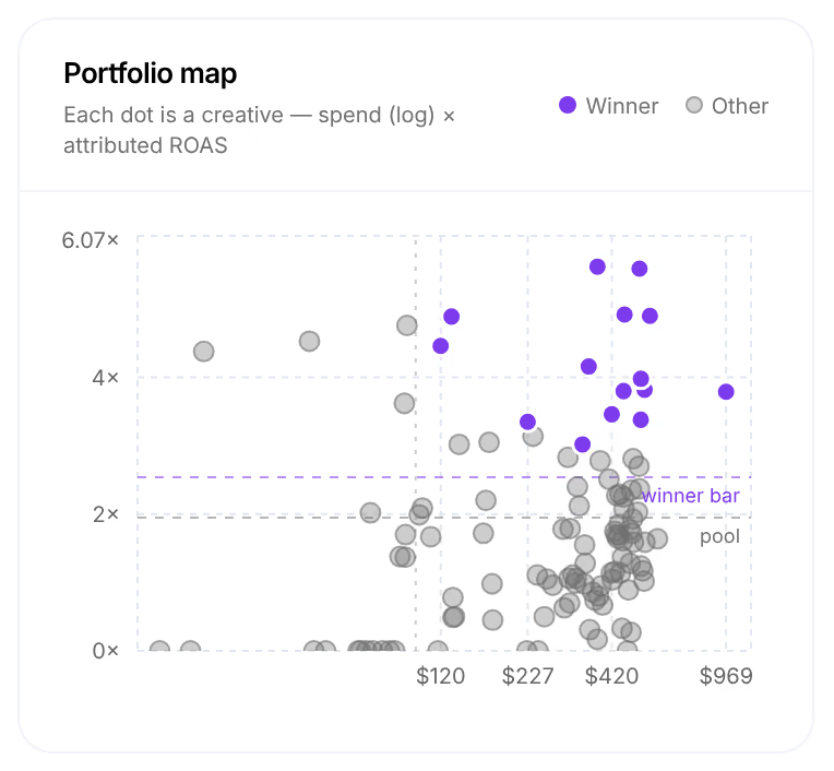
  • Portfolio Map — every creative as a dot: spend across, ROAS up, with your average and the winner bar drawn in. Winners are the violet dots above the line; a dot far right and low is where budget is leaking.
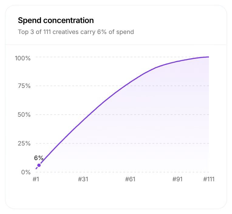
  • Spend Concentration — how dependent you are on your top creatives (“Top 3 of 18 creatives carry 24% of spend”). A curve that shoots up immediately means one or two ads carry the account.
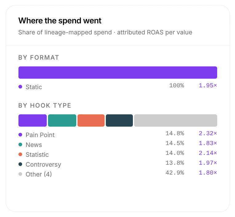
  • Where the Spend Went — your budget split By format and By hook type, with the return each share earned.

Creative Leaderboard

Every launched creative, ranked by attributed return — no naming conventions required.

The Creative Leaderboard: each creative with its thumbnail, winner mark, hook and angle subline, spend share bar and attributed outcomes

Each row carries its thumbnail and, under the name, a Winner mark when it clears your bar plus its hook · angle — so you can see at a glance that your top performer is, say, a question hook on the Science-backed results angle. Share shows each creative’s slice of spend; the attributed columns run through Orders, Revenue, ROAS, POAS and CPA.

Combinations — the DNA lab

Single parts win, but pairings often win bigger. The Combinations  view is one connected lab for the whole question: which variables work, which combinations work, and which combinations you’ve never even tried.

Pick the lens first — POAS, ROAS, CVR or Spend — and all three zones repaint.

The DNA lab: the Variables rail with every dimension ranked, above the Hook × Avatar matrix

The Variables

One column per dimension — Customer Avatar, Angle, Hook, Offer, Product, Hook Type, Headline and more — each value ranked by how much spend it carried, painted by your chosen metric. The header counts tell you how much of your library the market has actually seen: 4 of 4 avatars tested, but maybe 6 of 18 hooks.

Click any value to focus it: every other column recomputes for that value alone. Focus The Busy Parent and the Hook column becomes “which hooks work for The Busy Parent” — that’s the question generic ad reporting can’t answer.

The Matrix

Choose any two parts — Hook × Avatar, Angle × Offer, Headline × Landing Page — and every pairing becomes a cell, colored by performance and marked “1 tested of 72 possible pairs” so the size of the unexplored space is always in view.

The Matrix with a selected cell: the pairing's economics, its confidence range, the creatives carrying it and the Generate with this pairing button

  • Colored cells are tested pairings — violet above the breakeven or benchmark, rose below. Hatched cells ran on under $50 of spend: treat them as hints, not verdicts.
  • Dashed cells never ran together. Click one and Omnymous tells you whether each half has proven itself separately — an untested pairing of two individually-strong values is your cheapest next experiment.
  • Click any cell and the panel shows its spend, orders, revenue, CM2 profit, the CVR confidence range and the creatives carrying the pairing — then hands off with Generate with this pairing, which opens the Studio with both parts preloaded.
  • Show untested adds library values that have never launched at all; All tested values expands past the top rows and columns.

Winning Recipes

The table at the bottom ranks every 2–3-part combination by CM2 — the contribution profit it produced, not just revenue. Use the preset pairings or compose your own three-part recipe, and raise the minimum-spend filter ($0 / $50 / $100 / $250) when a “winner” looks too good to be true — sparse pairings get lucky on a few dollars all the time.

Pages

The Pages  view covers where your traffic lands.

The Pages view: The Funnel with every stage from Sessions to Purchases, next to the Survival by Channel grid

  • The Funnel walks every visit from SessionsView ContentAdd to CartCheckoutPurchases, with the conversion between each stage and your session-to-purchase rate, session revenue and revenue per session below.
  • Survival by Channel shows the same journey per traffic source — if Meta traffic reaches the cart at twice the rate of TikTok traffic, it’s visible in one glance.
  • Page Templates ranks which of the built-in page templates converts paid traffic best, with each template’s Share of spend and its CVR Range confidence bar.
  • The Landing-Page Funnel breaks the journey down per entry page, so a page that loses everyone at the cart is obvious at a glance.

The Landing-Page Funnel: each entry page across Sessions, View Content, Add to Cart, Checkout and Purchases, with CVR, revenue and the confidence range

Reading the confidence columns

Alongside exact numbers, ranked tables add two columns that tell you how much to trust a result:

  • CVR Range — a confidence range for the true rate, drawn as a small bar. A wide bar means there isn’t enough spend behind it yet to be sure; a tight bar means the number is solid.
  • P>Avg — the chance this value truly beats your account average. High is good; near zero means it’s a laggard.

Insights

The Insights  view is Omnymous watching your data for you. Eight detectors run daily — creative winners, winning and losing concepts, creative fatigue, wasted spend, budget shifts, page tests and tracking health — and each one is statistically gated, so it only fires when there’s enough evidence to trust.

The Insights feed: findings like Creative Winner and Budget Shift, each with a severity, an action button and a Why this fired section

  • Every finding carries a one-click action back into the work — Open in Launcher, Generate more on this concept, Compare campaigns — so an insight is never a dead end.
  • Why this fired under each card opens the exact evidence: the spend, the returns and the thresholds it cleared. No black boxes.
  • Work the feed with the New / Acknowledged / Actioned / Dismissed filters: Acknowledge what you’ve seen, dismiss what you disagree with, and anything you action is tracked as handled.
  • How insights work (top right) explains all eight detectors in plain language.

How much of your spend is explained

Wherever creative analytics ranks by lineage, it shows a quiet honesty note: Explains N% of ad spend. That’s the share of your ad spend these rows can actually account for. Ads you imported from a platform (or any creative without lineage) can’t be decomposed, so they’re left out — and the note keeps that in view, turning amber when coverage is low, so you never scale a “winner” measured on a sliver of your budget.

Launching your creatives through Omnymous is what keeps that number high — every part is tracked automatically, so more of your spend becomes explainable.

Troubleshooting

The leaderboard (or the DNA lab) is empty. These views only rank creatives whose lineage Omnymous tracked — which happens when you build and launch through the platform. Launch a batch from the Launcher and the tables fill themselves as spend comes in. Ads imported straight from a platform have no lineage to decompose.

Every range is wide and the numbers look unsure. There isn’t enough spend behind them yet. A CVR Range bar narrows as a hook, angle or page accumulates budget — give the winners more spend, or widen the date range, and the estimates firm up.

No insights are showing. Detectors run daily and are deliberately strict — a quiet feed means nothing has cleared the evidence gates yet, which is normal in the first days after connecting. Check back once your campaigns have a week of spend behind them.